As I aim to de-clutter my life by the casting off of knick-knacks, unused sleeping bags, and furniture that screams "FUNCTION!" -- like the media console I bought four years ago that I now find hideous -- I find myself also wanting to simplify the look of my blog.
My design inspirations are this one and this one, although now I'm mad that I've seen both of those because I'm really tempted to copy their ideas. (I invented dandelions!)
I also love Anthropologie's clean, feminine look.
But then I love my blog's eclectic, patterned aesthetic.
What do you think? Any suggestions, or other sites I should look at for inspiration?
Anonymous comments are welcome here. ;-)
UPDATE -- (one hour later) Obviously, I went ahead and played with the coding and came up with something completely different than I had before. Still, please do share your comments and suggestions on the look, if you have any ideas! :-)
UPDATE 2 -- Anonymous brings up a good point. Since I was hot to trot and already changed the background without letting you weight in, you may not remember what the old one looked like! It was this header image:

With this background:

The funny thing is, the coding to get the main wrapper semi-transparent and to get the background the way I wanted it on the old look was so much more complicated than my new look -- and required the use of an FTP -- and this one is pretty easy-peasy, but looks more designy, I think.


5 comments:
Simplicity is good & I like the new look except I can't really remember the old look..... which means you should keep this one. Right?
I love your new pseudo-Anthropologie look. It's easier to read because you don't have the background behind the text. White space is good! Good job!
the anthro look is divine! also, quite pleased you loved the our new blog layout. shux... ;)
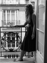
Where was your new profile pic taken? it looks tres french!
Thanks, Abs! It was indeed taken in Paris. It's an oldy! That was the balcony in my room during the summer I studied abroad (2006). Le sighhh...
Post a Comment